Wednesday, July 18, 2012

Sampling Distributions of t When Stopping Intention is Threshold Duration

Consider two groups of data on a metric scale, for which we want to conduct a t test. To compute the p value of t, we need to determine its sampling distribution, which is the relative probability of all possible values of t that would be obtained from the null hypothesis if the data-collection procedure were repeated ad infinitum. Therefore ---as many statisticians have pointed out--- the sampling distribution of t depends on the stopping intention assumed by the analyst, because the stopping intention influences the relative probabilities of data sets from the null hypothesis. The conventional assumption is that data collection stopped when the sample size, N, reached a threshold. Under this conventional assumption, every imaginary sample from the null hypothesis has the same sample size, N. However, many researchers collect data until a threshold duration instead of a threshold N. There is nothing wrong with the stopping intention of threshold duration instead of threshold sample size, because the data are completely insulated from the researcher's stopping intention: The nth datum collected is uninfluenced by how many other data have been collected previously or are intended to be collected later. But the space of imaginary data that could arise from the null hypothesis does depend on the intention to stop at threshold duration, because the sample size is a random value across imaginary repetitions of the study. I have pointed this out and given examples in various articles and presentations (especially here but also here), but many people ask about the mechanics behind the examples. This blog post shows a few simple examples.

Imagine generating random data from the null hypothesis, for a fixed duration. Data appear randomly through time. Thus, for a given duration, there is a certain probability that N=4, that N=5, that N=6, and so on. For any fixed N, the sampling probability of t is given by the conventional t density. To derive the t distribution for sampling for a fixed duration, we simply add the t distributions for each possible N, weighted by the probability of getting N. That's easy to do mechanically in a computer program. All we have to do is specify p(N) for each N.

As a concrete example, suppose we have data with N=8 in each of two groups. We might have gotten those data when intending to stop at N=8 in each group, that is, N=16 altogether. Then the probability of N looks like the left panel below, with a "spike" at N=16, and the probability of getting extreme t values from the null hypothesis is shown in the right panel below, with the critical value as in the conventional tables:

But what if the data collection involved posting a sign-up sheet for a fixed duration, so that the number of volunteers is a random value, and, moreover, the actual data is collected in a room that seats a maximum of 16 people. Then the probability distribution across sample sizes might look like the left panel below, with the resulting t distribution on the right:
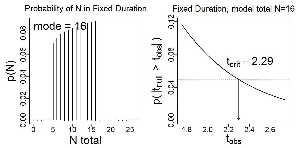
Notice in the right panel (above) that the sampling distribution of t has a heavier tail and larger critical value to achieve p<.05

And what if data collection involved posting a sign-up sheet for a fixed duration, but the data-collection session is not run unless at least 16 people sign up? Then the probability distribution across sample sizes might look like the left panel below, with the resulting t distribution on the right:
Notice in the right panel (above) that the sampling distribution of t has a lighter tail and smaller critical value to achieve p<.05

Here's the problem: Suppose we are given some data, with N=16 and tobs=2.14. What is the p value? It depends on the stopping intention assumed by analyst, even though the stopping intention has no influence on the values in the data.

Here's the R program for generating the plots above:
# TsamplingUntilThresholdDuration.R
graphics.off()
rm(list=ls(all=TRUE))
fileNameRoot = "TsamplingUntilThresholdDuration"

# Specify the probability of getting each candidate sample size N during the
# fixed duration:
# Nprob is relative probability of getting each N, from 0 to length(Nprob)-1:
NprobSelection = c("LowSkew","Spike","HighSkew")[1] # type 1, 2, or 3 inside []
if ( NprobSelection=="LowSkew" ) {
  Nprob = c(0,0,0,0,0,1,2,3,4,5,6,7,8,9,10,11,12, 0, 0, 0, 0, 0, 0, 0, 0, 0, 0, 0)
  Nprob = Nprob^0.1
}
if ( NprobSelection=="Spike" ) {
  Nprob = c(0,0,0,0,0,0,0,0,0,0,0,0,0,0, 0, 0,12, 0, 0, 0, 0, 0, 0, 0, 0, 0, 0, 0)
}
if ( NprobSelection=="HighSkew" ) {
  Nprob = c(0,0,0,0,0,0,0,0,0,0,0,0,0,0, 0, 0,12,11,10, 9, 8, 7, 6, 5, 4, 3, 2, 1)
  Nprob = Nprob^0.1
}
Nposs = 0:(length(Nprob)-1) # vector of N values for components of Nprob
# Outlaw getting less than 4 total (2 per group):
Nprob[1:4]=0
Nprob = Nprob/sum(Nprob) # normalize so it's a true probability distribution

# Prepare plotting parameters:
windows(width=10,height=5)
layout( matrix(1:2,ncol=2) )
cexLab = 2.25
cexMain = 1.75
cexAxis = 1.5
cexText = 2.25
marPar = c(4,5,3,1)
mgpPar = c(2.5,0.5,0)
par(mar=marPar,mgp=mgpPar)

# Plot the probability of each N:
plot( Nposs , Nprob , type="h" , lwd=3 ,
      xlab="N total" , ylab="p(N)" ,
      main=bquote("Probability of N in Fixed Duration"*"") ,
      cex.lab=cexLab , cex.main = cexMain , cex.axis=cexAxis )
text( 0 , max(Nprob) , paste("mode =",Nposs[which.max(Nprob)]) , adj=c(0,1) ,
      cex=cexText )

# Compute cumulative t distribution:
tObs = seq(1.75,2.75,length=2001) # vector of observed t values for x axis.
pAnyTgtTobs = rep(0,length(tObs)) # prob any null t greater than observed t.
for ( n in 4:length(Nposs) ) { # start at 4 because df=(n-2) and Nposs[4] is 3.
  pAnyTgtTobs = pAnyTgtTobs + Nprob[n] * 2 * ( 1 - pt( tObs , df=(n-2) ) )
}
critVal = min( tObs[ pAnyTgtTobs <= .05 ] )

# Plot the cumulative t distribution:
#windows(width=7,height=7)
yLim = c(0,0.12)
textHt = 0.065
plot( tObs , pAnyTgtTobs , ylim=yLim ,
      xlab=bquote(t[obs]) ,
      ylab=bquote("p( "*abs( t[null] )*" > "*abs( t[obs] )*" )") ,
      cex.lab=cexLab , cex.main = cexMain , cex.axis=cexAxis ,
      main=bquote( "Fixed Duration, modal total N="* .(Nposs[which.max(Nprob)]) ) ,
      type="l" , lwd=2 )
abline( h = 0.05 , lty="dashed" )
text( 0 , 0.05 , "p=.05" , adj=c(0.25,-0.3) )
arrows( critVal , 0.05 , critVal , 0 , length=.1 , lwd=2.0 )
text( critVal , textHt ,
      bquote( t[crit] == .(signif(critVal,3)) )  , adj=c(.25,0) , cex=cexText )
plotFileName = paste(fileNameRoot,sep="")
savePlot(paste(plotFileName,NprobSelection,sep=""),type="eps")
savePlot(paste(plotFileName,NprobSelection,sep=""),type="jpg")

Friday, July 6, 2012

It's getting warmer in Wisconsin!

As an illustration of how straight forward it is in JAGS/BUGS to fit non-linear trends to data, I estimated the parameters of a sinusoid-plus-linear trend when fit to average daily temperatures. The temperatures are for Madison, Wisconsin, in honor of my Bayesian analysis workshop there next week. Conclusion: Both the approaching workshop and the linear trend in the temperatures indicate that it's getting warmer in Wisconsin!

Here (below) are the data (obtained from the University of Dayton Average Daily Temperature Archive) with a smattering of credible regression curves superimposed on the data. There are 20 curves, each using different parameter combinations from 20 widely-separated steps in the MCMC chain.


The panels at the bottom of the figure show the marginal posterior distributions of the parameters. In particular, the linear trend parameter is credibly non-zero, and suggests that on average over the last 17 years, the average daily temperature has increased by 0.059 degrees Fahrenheit per year (i.e., about 0.59 degrees per decade).

Details:

Here is the JAGS model statement:
model {
    for( i in 1 : Ndata ) {
        y[i] ~ dt( mu[i] , tau , nu )
        mu[i] <- beta0 + beta1 * x[i] + amp * cos( ( x[i] - thresh ) / wl )
    }
    beta0 ~ dnorm( 0 , 1.0E-12 )
    beta1 ~ dnorm( 0 , 1.0E-12 )
    tau ~ dgamma( 0.001 , 0.001 )
    amp ~ dunif(0,50)
    thresh ~ dunif(-183,183)
    nu <- nuMinusOne + 1
    nuMinusOne ~ dexp(1/29)
}

The predicted value, mu, is a linear trend, beta0 + beta1 * x[i], plus a sinusoidal deviation, amp * cos( ( x[i] - thresh ) / wl ). Notice that the data are assumed to be distributed as a t distribution, not as a normal distribution, around the predicted value mu. The heavy tails of a t distribution accommodate outliers. The df parameter of the t distribution, nu, is estimated from the data. (I put an exponential prior on nu; you can read more about "robust estimation" in this article.) In this version of the model, I assumed a fixed wavelength of 365.24219 days per cycle. That's a "tropical year". Hence the wl parameter in the model was set at 365.24219/(2*pi) to convert to radians. In other versions I estimated wl and it came out to be very close to the duration of a tropical year.

Quibbles:

Maybe the linear trend is an artifact because of the arbitrary alignment of start and stop dates on the cycle. Two reasons to doubt this explanation. First, the sinusoidal component is supposed to "soak up" variance due to the cycle, thereby reducing influence of end points of the data. Second, as a check, I constructed an artificial data set that had zero linear trend, and examined the estimated linear coefficient. To do this, I took the 2003 data and concatenated that cycle to itself 17 times. Therefore the artificial data had the same sort of alignment issues as real data. The resulting estimate of the linear trend had zero very near its mode.

The sinusoid doesn't seem to capture the actual shape of the temperature cycle very accurately. The extremes in the actual temperatures seem to go beyond the peaks in the sinusoidal curve. The tails of the t distribution accommodate the high extremes in summer and the low extremes in winter, but the temperatures are not symmetrically distributed around mu throughout the year. If anyone can tell me a better model of annual temperature trends (that's also easy to write in JAGS for demo purposes), please let me know.

The data violate the assumption of independence in the model. The model assumes that, on each day, the  temperature is a random draw from a t distribution centered on mu, with no influence from the temperature of the previous day. Clearly this is wrong as a description of real temperatures. Does this mean the model is utterly useless and uninterpretable? Maybe not. We can think of the likelihood function, which multiplies together the t-distribution densities of all the data points, merely as a measure of fit rather than as a generative model of data. The estimated parameters tell us about the descriptive fit, not about the process that generated the data. Maybe.  UPDATED WITH AUTO-REGRESSIVE AR(1) TERM HERE!

Saturday, June 30, 2012

Courses that use Doing Bayesian Data Analysis?

Instructors seek examples of using the book, Doing Bayesian Data Analysis, as part of a course. A cursory web search yielded these few listed below, but there must be others. For example, my own course web page did not show up in the search, nor did another course from which a published review of the book arose. Please let me know of other courses that use the book, and I will update this list in a subsequent post.

Monday, June 25, 2012

Workshop, July 11-13, U. Wisconsin, Madison

Workshop at the University of Wisconsin at Madison, July 11-13. Three full days of doing Bayesian data analysis. See details and registration info here.

A list of some previous workshops is here.

Wednesday, June 6, 2012

Mixture of Normal Distributions

In this post I show a simple illustration of a mixture of normal distributions. For the examples, we assume we have metric values that we suppose are generated by a mixture of two different normal distributions, which I'll call clusters. We don't know which datum came from each cluster. Our goal is to estimate the probability that each score came from each of the two clusters, and the means and SD of the normal distributions that describe the clusters.

The model specification (for JAGS): The assumes that the clusters have the same standard deviation, but different means.

model {
    # Likelihood:
    for( i in 1 : N ) {
      y[i] ~ dnorm( mu[i] , tau )
      mu[i] <- muOfClust[ clust[i] ]
      clust[i] ~ dcat( pClust[1:Nclust] )
    }
    # Prior:
    tau ~ dgamma( 0.01 , 0.01 )
    for ( clustIdx in 1: Nclust ) {
      muOfClust[clustIdx] ~ dnorm( 0 , 1.0E-10 )
    }
    pClust[1:Nclust] ~ ddirch( onesRepNclust )
}


The data specification:

# Generate random data from known parameter values:
set.seed(47405)
trueM1 = 100
N1 = 200
trueM2 = 145 # 145 for first example below; 130 for second example
N2 = 200
trueSD = 15
effsz = abs( trueM2 - trueM1 ) / trueSD
y1 = rnorm( N1 )
y1 = (y1-mean(y1))/sd(y1) * trueSD + trueM1
y2 = rnorm( N2 )
y2 = (y2-mean(y2))/sd(y2) * trueSD + trueM2
y = c( y1 , y2 )
N = length(y)

# Must have at least one data point with fixed assignment 
# to each cluster, otherwise some clusters will end up empty:
Nclust = 2
clust = rep(NA,N) 

clust[which.min(y)]=1 # smallest value assigned to cluster 1
clust[which.max(y)]=2 # highest value assigned to cluster 2 
dataList = list(
    y = y ,
    N = N ,
    Nclust = Nclust ,
    clust = clust ,
    onesRepNclust = rep(1,Nclust)
)

Results when mean of cluster 2 is 3 standard deviations away from mean of cluster 1: The posterior recovers the generating values fairly well.

Upper panel: Data with underlying normal generators.
Lower panel: For each datum, the posterior probability that it is assigned to cluster 2.

Marginal posterior on cluster means and SD.

Pairs plot of cluster means and SD.


Results when mean of cluster 2 is 2 standard deviations away from mean of cluster 1: There is lots of uncertainty. See captions for discussion.

Lower panel: Notice that the lowest and highest data values have fixed cluster assignments, but all the other data values have posterior probabilities of cluster assignment noticeably far from 0 or 1.

Notice the bimodal distribution of sigma (SD).

Notice in the in the right column that when sigma is small, around 15, then the cluster means are near their true generating values. But when sigma is large, then the cluster means get close together. Essentially, there is a bimodal posterior: Either there are two clusters, with smaller sigma and distinct means, or there is one cluster, with larger sigma and both cluster means set near the mean of the one cluster.


Friday, June 1, 2012

Beta distribution parameterized by mode instead of mean

In this post, I describe how it is easier to intuit the beta distribution in terms of its mode than its mean. This is especially handy when specifying a prior beta distribution. 

(In a previous post, I explained how it is easier to intuit the gamma distribution in terms of its mode instead of its mean.)

A problem with using the mean to describe a distribution is that for skewed distributions, the mean may be far from the mode, but the mode may be what we intuitively want as the "descriptive handle" on the distribution, and therefore the mean is not a good surrogate for the description of central tendency. Especially when we are specifying a prior distribution, we may want to express our intuition in terms of the mode of the prior instead of the mean.

For a beta distribution with shape parameters a and b, the mode is (a-1)/(a+b-2). Suppose we have a desired mode, and we want to determine the corresponding shape parameters. Here's the solution. First, we express the "certainty" of the estimate in terms of the equivalent prior sample size,
k=a+b, with k≥2. 
The certainty must be at least 2 because it essentially assumes that the prior contains at least one "head" and one "tail," which is to say that we know each outcome is at least possible. Then a little algebra reveals:
a = mode * (k-2) + 1
b = (1-mode) * (k-2) + 1

Here are a few examples:


The book expressed beta distributions in terms of mean and certainty instead of mode and certainty; cf. Eqn. 5.5, p. 83, where m denoted the mean and n denoted the certainty instead of k used here.